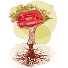
When we met matrixpoint last week in Boston, he mentioned that he doesn’t like to be reminded of the red couch every time he’s visiting the OpenCouchSurfing website. First we jokingly thought, maybe of adding some black. But amylin decided that transparent silverish looks better, and I fully trust her in these matters.
I hope no one will seriously object to changing the color of the couch.
I don’t mind the change, but I’d suggest it be proposed and leave a time for people to give feedback before we make a change.
maybe green?
jajaja
just kidding
silver looks fine
I think amylin should make an entirely new design.Which incorporates couch surfing and also the ocs spirit into it .
The present design shows a top down management which was relevant when the members as the CSC MTL were creating the management structure for couchsurfing 2.0.But 2.0 is dead so lets have a design which shows couchsufing as and open and transparent organisation.
daz, a new design might be nice, but it would take her time. This logo is still very recognizable, and I think it was not conceived from a top-down model.
Also, I think it would be better if she spent time designing a logos for Crash at Mine, Planet Hospitality and other new projects. Then again, I’ll send her a link to these comments so she can decide for herself.
I also think it was accidentally wrong or actually, it was right for CouchSurfing. The leaders and admins form the roots and trunk, the members are the fruits… But actually it should have been that the members form the roots and trunk and the fruits form all beautiful things which grow out of this… I never understood why you chose this for CouchSurfing, as CouchSurfing always meant for me the latter.
It would be cool when a logo could represent this.
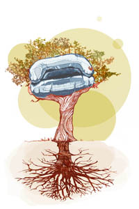
Adia, who is “you”? I hadn’t even met amylin yet when she designed the tree.
Callum, I think a week is enough, right? I can change the logo on the blog some time this week and you change it on the wiki?
adia “why you chose this for CouchSurfing”
I think he means the people in power at the MTL collective. Who chose it at that time. Unless you (kasper)a normal couchsurfer at that time could choose the logo.
More like people present during the crash week (June 30th-July 7th or so). There should be pictures on the site still confirming roughly who was present, but at least Casey, Heather, Jim, Rachel, Amylin and John were around (and MrRico, Cosmic Girl and some others were living locally). (interesting facts here are that Amylin designed the logo and John the mission statement “make the world a better place, one couch at a time”, according to what I’ve read by him here (sorry can’t seem to locate the exact quote, maybe someone else can))
Kasper, sure, let’s do it. I can do it on the blog also if you like, it might make it easier to keep up to date.
“interesting facts here are that Amylin designed the logo and John the mission statement ‘make the world a better place, one couch at a time’”
Just to be clear: I proposed the concept of a short mission statement that would be prominently displayed on the website. I offered general suggestions for the specific sentence, as examples. The concept was accepted by the working group at the Collective. Then Heather drafted a preliminary version, and asked various people for their input. I contributed an edit to the draft which became part of the final version.
Prior to my suggestion of a simple, catchy mission statement, there was a lengthy philosophical statement containing about 7 parts, if I remember right, that members would be required to accept in order to re-register after the crash. The proposal for a simple mission statement was, in part, a strategic compromise to avoid driving members away with an imposed philosophy, which most of us felt should be a personal matter.
John
“I think he means the people in power at the MTL collective. Who chose it at that time. Unless you (kasper)a normal couchsurfer at that time could choose the logo.”
During the week after the crash, whoever happened to be there at the Montreal Collective had some opportunity for significant influence. For a time, ordinary members were had almost equal influence to the “powers”. But within a few days, Casey and the Admins began reasserting their control over the project.
Amylin’s drawing was done during a time when there was a strong sense of rebirth (CS 2.0 Phoenix) in which the CS Community would take center stage, not the Founders and Admins. Her drawing gave them appropriate respect as the roots of the tree, but the tree with its growing and spreading branches representing the Community. At least that’s how I understood it.
Amylin’s beautiful contribution, and those of many others since, were inspired by the shared vision of a Community with identity based on hospitality, generosity, mutual respect and tolerance, equality and inclusiveness.
Symbolically, the eventual actions of Casey and the Admins were like the cutting down of the tree and replacing it with a pyramid with themselves at the top. I’m glad the spirit of Amylin’s tree has found a new home.
The whole notion of a “Couchsurfing Project” intended to define CS as a joint creative enterprise (of which Collectives were to be a part) is completely out of place now. It’s now the “Couchsurfing Corporation” and Collectives are work camps where interns can do whatever house chores they are ordered to do, work for 35 hours a week with no pay (in part for the monetary benefit of Casey, Jim and Matthew), and then go home (if they can avoid jail for visa violations) with the expectation of getting a job with another corporation because they had experience as unpaid laborers for the “respected” CS Corporation. Those selected for this rare privilege should be grateful! Certainly, any great ideas they had while working at the Collective should belong exclusively to the CS Corporation. Forgive my sarcasm, but I how else can one cope with this travesty but with a little humor.
John
It would have been lovely if the community was always on top after 2.0(not) . But with all the hierarchical structure which came in as soon as it was up ie ambassador structure,ninja powers gave a real bad taste and so looking at it . Bring back memories when heaven turned to hell. It is lovely but the place where it used to be …
” A tree structure is a way of representing the hierarchical nature of a structure in a graphical form.”